The holidays are upon us and that can only mean one thing: one-upping your neighbor for the best, brightest, and most fossil fuel-consuming Christmas light decoration on your block. But for every ostentatiously lit house on your street, there are those houses that take a more subtle approach. And that logic can be applied for your holiday social designs. Customers appreciate it when you tastefully "decorate" your social sites to reflect the holiday season. And if you're looking for practical ways to do this, well, you're in luck.
Here are five examples of cool holiday social design strategies and the companies who do them well:
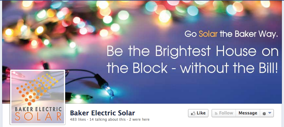
1. Maximizing "Prime" Social Real Estate (Baker Electric Solar) — This San Diego-based solar company tastefully redesigns what is perhaps their most valuable piece of social media real estate: their Facebook banner. The image itself is festive, yet not offensively so. They expertly employ soft colors and throw in some customized copy that ties their services to the holiday season ("Be the brightest house on the block - without the bill!") Bottom line: redesigning your Facebook banner is a no-brainer.

2. The Subtle, Product-Centric Approach (Target) — Check out Target's Twitter page and for a brief second you may think that is it, quite possibly, not Christmastime. That's because viewers aren't inundated with Christmas trees, reindeer, Santa and his elves, or any of the other typical holiday imagery. Rather, their products do the talking (or in this case, the inferring.) At the left hand corner, you'll see some Christmas-related products and videos, while the page's background includes Christmas tree ornaments (but again, very subtle. At first they look like strange yet colorful planets.) Our point: subtlety works.
3. "Holiday-ize" Your Brand (American Cancer Society) — Besides retail outlets like Target, the holiday season is, for a lack of better term, "big business" for nonprofits and charity organizations. As such, you can expect organizations like the Salvation Army, the Red Cross, and the United Way to embrace a holiday social design that reflects the importance of holiday giving.
One organization who has gotten a head start is the American Cancer Society. They redesigned their logo by placing it on what looks like a tiny gift card with a red bow on top. This redesigned logo is front and center on its Pinterest page. This seemingly minor adjustment does two things. One, it reminds followers that the holiday season is upon us, and two, by representing the "gift" of life without cancer, it edifies the Society's brand and encourages followers to donate.

4. Redesign Around Holiday Experiences (Crate and Barrel) Retailers always run the risk of making the holidays solely about commerce. So why not embrace the nostalgic, Norman Rockwellian experiences of the holidays? After all, it's a timelessly successful holiday marketing approach. One company who does it pretty well is Crate and Barrel. Furthermore, they do it on the social media platform that may be the most attuned to this visual, photographic-centric approach: Instagram. Their profile has photos of a plate of freshly-baked cookies, smiling people in cute hats, and piping hot cups of hot cocoa. It's whimsical, evocative, and fun. All that's missing is the Carpenter's Christmas album playing in the background.
5. Wrap Existing Promotional Campaigns in Holiday...Wrapping (Volkswagen) Interestingly, Volkswagen was one of the few auto companies who, at the time of writing, redesigned their Facebook page for the holidays (Chevrolet, Ford, and Toyota, for example, have yet to do so.)
VW has pretty cool social media crowdsourcing campaign called "Think Blue." On a separate "Think Blue" site, they encourage drivers to share their stories, talk about road trips, and provide related hash-tags (e.g. #VWBeetle, #TeamVWAtlanta.) VW not only integrates this campaign into its Facebook page, but also wraps it in a "Blue Christmas" holiday concept. A soft sky-blue color scheme dominates the Facebook page design. The Facebook banner includes a "Blue Christmas" logo. They have a separate tab on their Facebook profile page called "Think Blue Blue Christmas" which links to a promotion video. And so on. All in all, very cool cross-platform holiday campaign coordination.

On that Note, a Parting Comment: Coordinate Your Social Platforms!
Fun fact: as we mentioned, the aforementioned Volkswagen example is an outlier. During our research, we checked out both their social media sites as well as their home pages of all kinds of companies. In the process, we can upon a disturbing pattern. In almost 75% of all cases, many companies' landing pages were redesigned for the holidays, yet their social media sites were not. For example, Chevrolet's home page shows a smiling picture of Santa while its Facebook page has no trace of Kris Kringle (or any other holiday imagery for that matter.)
So our plea is simple. All we want for Christmas is for companies to embrace a cross-channel holiday marketing strategy. Really, is that too much to ask?
Need more tips for redesigning social for the holidays? Click the link for a complimentary consultation:


