
Your landing page should serve one purpose and one purpose alone: it should generate leads. In fact, some leads don't even need to be high-quality. What's most important is that you establish some sort of foothold with visitors so you can drive greater customer engagement in the future. Of course, most marketing managers will agree with the sentiment; the challenge, instead, is creating landing pages to make this goal a reality. Therefore, we'd like to take a look at tactics for effective landing page design.
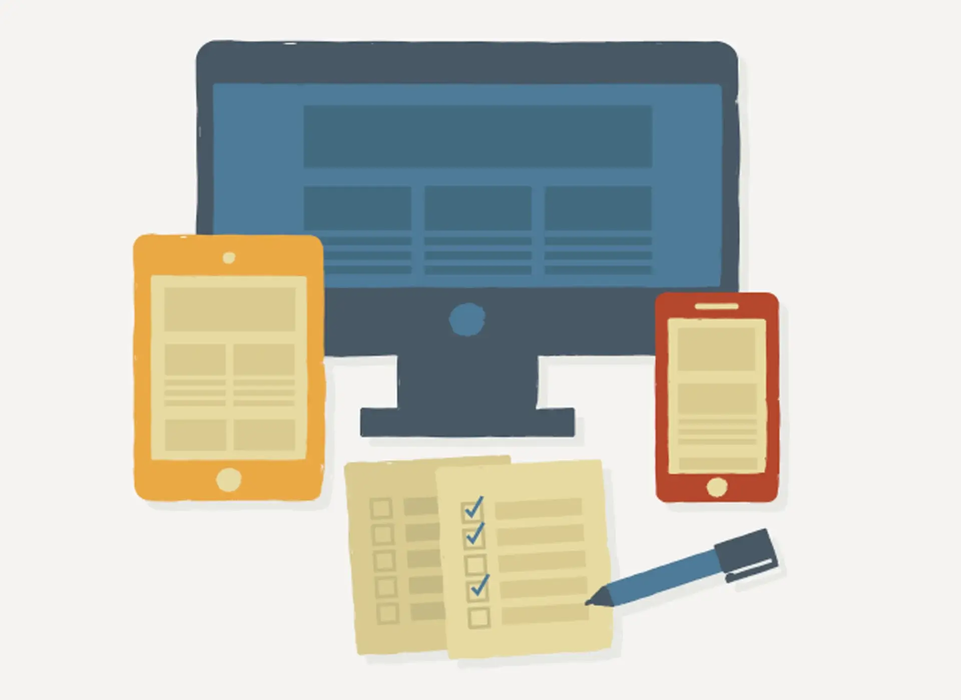
Landing Page Basics — Your landing page should be simple, easy-to-follow, and without clutter. Visitors should view it and within three seconds understand what they will be getting by filling out a contact form. Therefore, at a minimum, the page include:
- A crisp and informative headline.
- A compelling image.
- Text that resonates with the viewer. To truly get this step right, make sure to pull up with your sales team to understand what issues customers are facing. Make sure the copy speaks directly to the needs of your buyer personas.
- Text that is easy to follow. No one likes long paragraphs without section breaks. Bullets or checklists are far more effective. Set them up by saying, "By download this free white paper, you'll be able to: x, y, z."
- A strong call to action. Examples include: Get your free (offer), Sign up for (offer), Register for (event) now!, Download the (offer), etc. A side note: don't include a "Submit" button. Research suggests sites that have one realize a three percent lower conversion rate. The reason is simple: viewers perceive "submit" as an order, rather than a friendly suggestion. (We can't blame them.)
The Contact Form and Deliverables — Here is where some customization is required. Before you design your contact form, first ask yourself two things: where are these visitors on the customer purchasing funnel? And what will we be providing the once they sign up? These questions are important because the answers will dictate the length of your contact form.
- Top of the funnel. A good rule of thumb is to keep fields to a minimum. After all, more fields mean the visitor will need to take more time to fill them out, raising the risk of abandoning the page entirely. If the visitor is at the top of the funnel, as little as three fields will do: first name, last name, and e-mail address. These types of visitors, therefore, need to learn more about your brand, so you'll want to provide them with things like white papers and customer testimonials.
- Bottom of the funnel. For these types of visitors, your page can ask for more information. Things like position within a company or an optional phone number field. That said, the form should never exceed seven fields. The deliverables here will be things like free consultations or demos.
One last point. While the primary goal of effective landing page design is to capture leads, remember that results will vary based on the visitors themselves. For example, you'll generally see a higher conversion rate for those top of the funnel visitors because they'll enter less information. You'll see lower rates for bottom of the funnel visitors because either the forms are slightly longer or, as with the typical in-person sales pitch, it is always more difficult to "close" a sale than simply generate interest.
With that in mind, we'd like to throw the question to you, our readers. What landing page design principles have worked best for your firm? What approaches seem to drive conversion rates? What's most difficult about landing page design?
Landing pages are but one element in your lead generation toolkit. Want to learn more? Download our Lead Generation eBook.